TABLE Brand Refresh
Refreshed TABLE’s current brand to help business development and sales approach. The direction is to be trendy, confident and tech oriented.
My role:
Lead the effort and worked with another designer, we researched competitors, brainstormed and designed various prototypes on Figma. We had frequent touch base with the head of marketing to make sure the direction aligns with the ask. We worked parallel with a web developer and launched phase 1 of the webpages within 4 months.
Link to TABLE refreshed website (archived, delayed images loading).
The refreshed website features a parallax scroll to break up a dense information section with a complex toggle from A to B side.
We decided to simplified the multi brand colors developed from the product side, into a group of warm and cool tones for the marketing side. Keeping the orange, blue, and grey, we utilized bigger areas of white space to create breathing room for dense content.
We kept the same typeface but pairing the heavier weight in Italic with lighter weight to create an friendlier and modern tone.
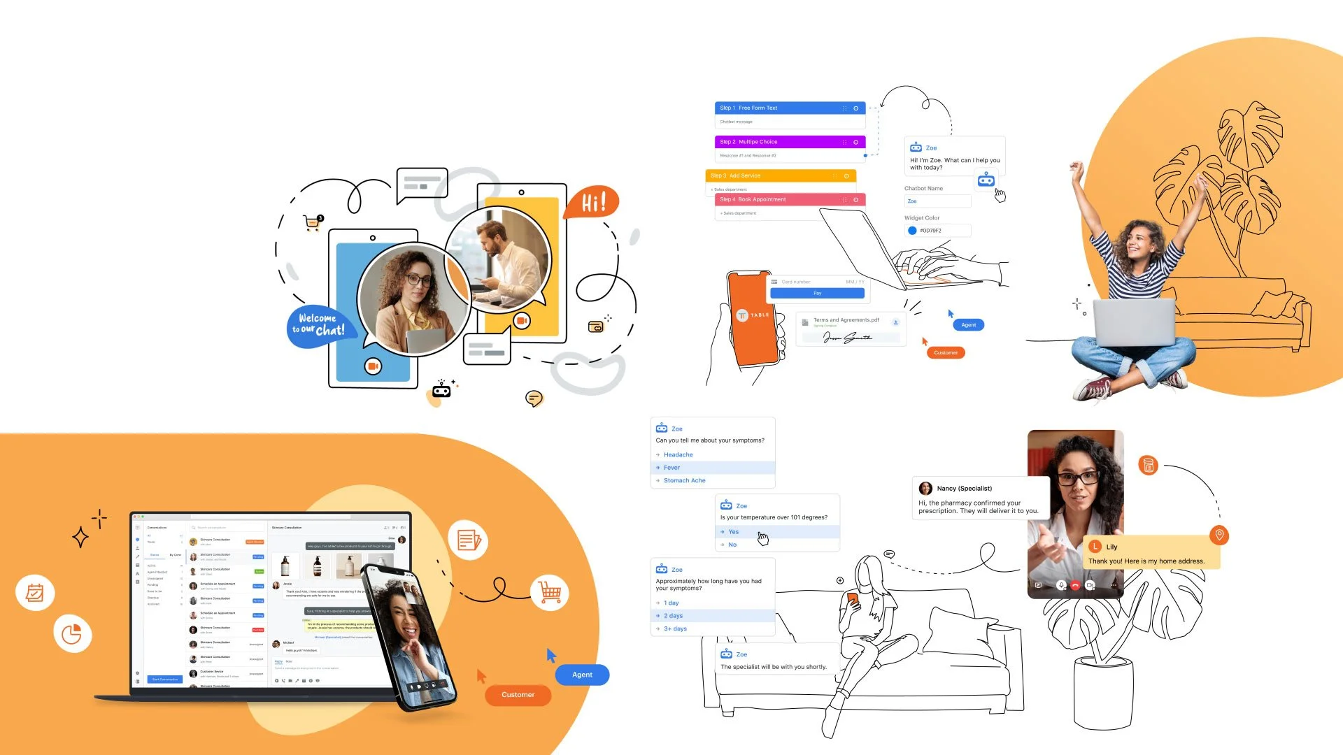
When we decided to use more illustrations in the brand, I created and maintained a library of line-art drawings on Figma for the marketing team. The library includes illustrations of a diverse group of people using laptop and mobile to convey TABLE’s ability to connect anywhere. These asset can be use in presentations, internal and external outreach, social media graphics and more. It’s in vector format and can be scale up without becoming blurry. The style is minimal with a punch of brand color on the digital devices.
This is also a departure from using solely serious stock images. The goal is to layer in illustrations into more candid stock images.
The brand refresh roll out also includes swapping out all the social media page’s banners.
A new brand guideline is created to provide guidance on how to use the new assets. Full PDF can be view here.


